Amanda Gunderson
Amanda Gunderson
Making meaningful experiences

 Case Study:

Airline UX

Banner_airplane_long2.jpg

Business Opportunity:

Building Customer Loyalty

One of the ways an airline brand can develop customer loyalty is through positive connections and experiences. The airline I worked with wanted to know how to create a stronger connection with their potential customers.

The Approach:

Getting to Know Users

Three users were asked to share a story about a time they booked a flight and then to demonstrate how they book a flight.

This helped me learn more about how they typically travel, preferences, methods, processes, challenges, likes, dislikes, frustrations, and general overall experiences.

 
post-its.jpg

Finding Themes

All information from the interviews were synthesized to find commonalities, differences and to see if any major themes stood out as a potential solution to the business opportunity.


An Interesting Question:

Can airlines do a better job at helping parents with young children on trips?

Even the most savviest of travelers expressed the lack of clarity around traveling with children.

 User Goal Statement:

My user is a parent that travels with their children + wants to ensure a smooth travel experience by being able to understand + select travel amenities that make traveling with their children easier.

red_square_long.jpg

Wireframes

After having a rough idea where a feature would potentially go, many rounds of sketched wireframes were created to test out if the original thoughts of feature placement worked, made sense and most importantly fit with the user goal.

Lo Fidelity Sketches


Digital Sketches


Understanding the User Flow

 
UserFlow_Screen_Complete.png

Complete User Flow

The user flow for most users booking an airline ticket is fairly similar. When focused on a specific user, mapping out the whole flow is helpful to understand where some of the new features might work best.

UserFlow_Screen_Seat_Luggage.png

Adding User-Focused Features

Notes for where to add new features or content that corresponds with an action or decision the parent is about to make.


Testing the Work

Methodology

  • Four users tested the prototype after being given a scenario. The goal of these tests is to determine if the usability and content of the site matched up with the user goal and if any gaps would be found along the way.

  • Users were asked to book a flight with their family of 4, including an older child and a lap infant to try to cover both types of child travelers and to layer in the complexities faced parents flying with their children.

  • Sub tasks were included to bring attention to a couple of unconventional pages in prototype.

  • All users tested had experience with flying with children + infants.

  • Data was collected on things they found helpful, roadblocks, travel preferences, and more.

 
red_square_long.jpg

Features tested

Adding Infants + Children

 
TravelerPicker.jpg

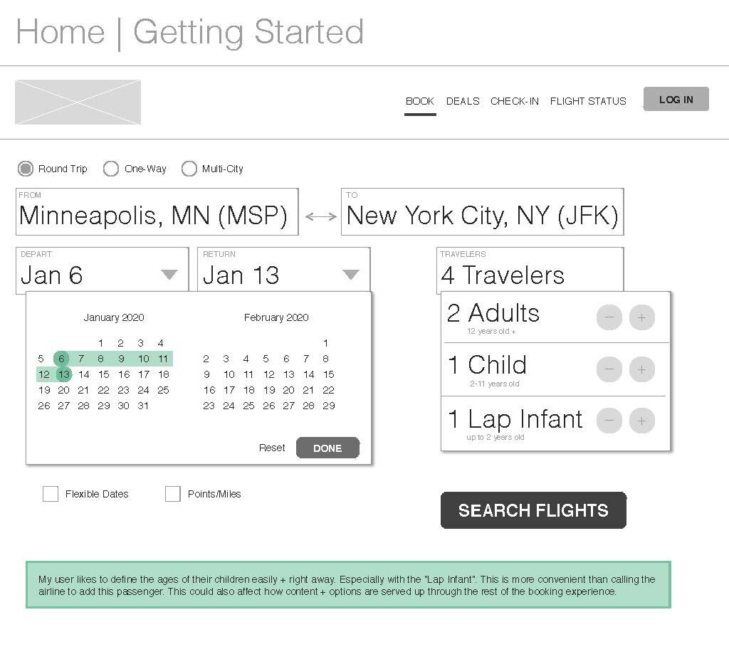
My user likes to define the ages of their children easily + right away. Especially with the “Lap Infant”. This is more convenient than calling the airline to add this passenger. This could also affect how content + options are served up through the rest of the booking experience.

User Test Findings:

“I like that I can add a Lap Infant right away, this saves time in later steps”
This was very intentional as it saves the user time since they don’t have to call the airline to add a lap infant to their flight reservation.

“It’s not clear the differences between a Child (0-11 years old) and a Lap Infant (0-2 years old)”
Most users hesitated with this widget and some called out parts that were unclear to them. Another area that created confusion was the Infant Seating Options section on the Seats page. Moving that information to this widget as a modal information icon could make both parts a much clearer experience.


Knowing You’re Getting the Best Deal

 
FlightPicker.jpg

My user wants to align travel times with their family’s rhythm to the best of their abilities. They pay close attention to the total travel time + typically avoid layovers unless it helps break up a large amount of travel time. They are interested in in-flight entertainment + snack/meal options and availability.

User Test Findings:

“I like that it gives me more information than I assumed it would.”
The flight selector provides the user with an informed upgrade that’s calculated in real-time. This helps the user by not making them chase & compare prices on multiple screens or even browser tabs.

“I’m not really sure how to select my flight.”
The largest gap I uncovered was that selecting a flight from grid wasn’t exactly intuitive. This is important to my user goal because selecting the flight gives the parent an informed upgrade option to potentially help their travels go smoothly.


Infant seating options

 
Seats.jpg

My user may be a new parent that may want to fly with their infant in a car seat rather than travel on their lap. This would allow them to change their mind during the seating process.

User Test Findings:

“Are they trying to charge me to bring aboard a car seat?”

“Choosing a seat is the most important thing, especially when traveling with kids.”

The option to change from a lap infant to an infant with a purchased seat was unclear for users. Possibly not necessary if a part of the initial decision to add a lap infant or not.


Infant + Child Bag Policies

 
Bags.jpg

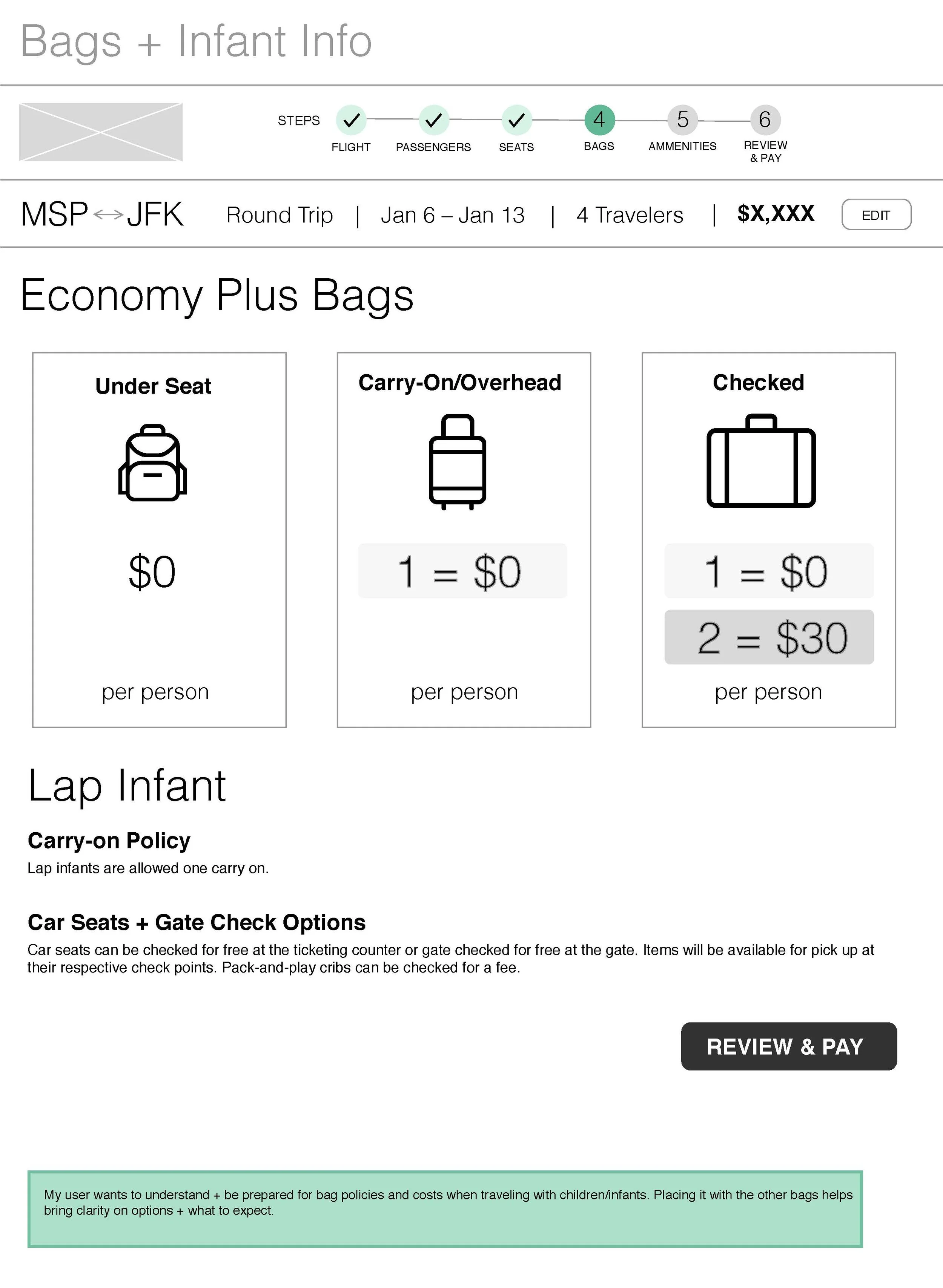
My user may be new to flying with car seats in tow. Some information around this is helpful and provides some peace of mind.

User Test Findings:

“That’s nice, because infant + child bag or gate check information isn’t always provided”
All users noted how clear this was & helpful. Once again, not having to research their options.


Comfort Amenities


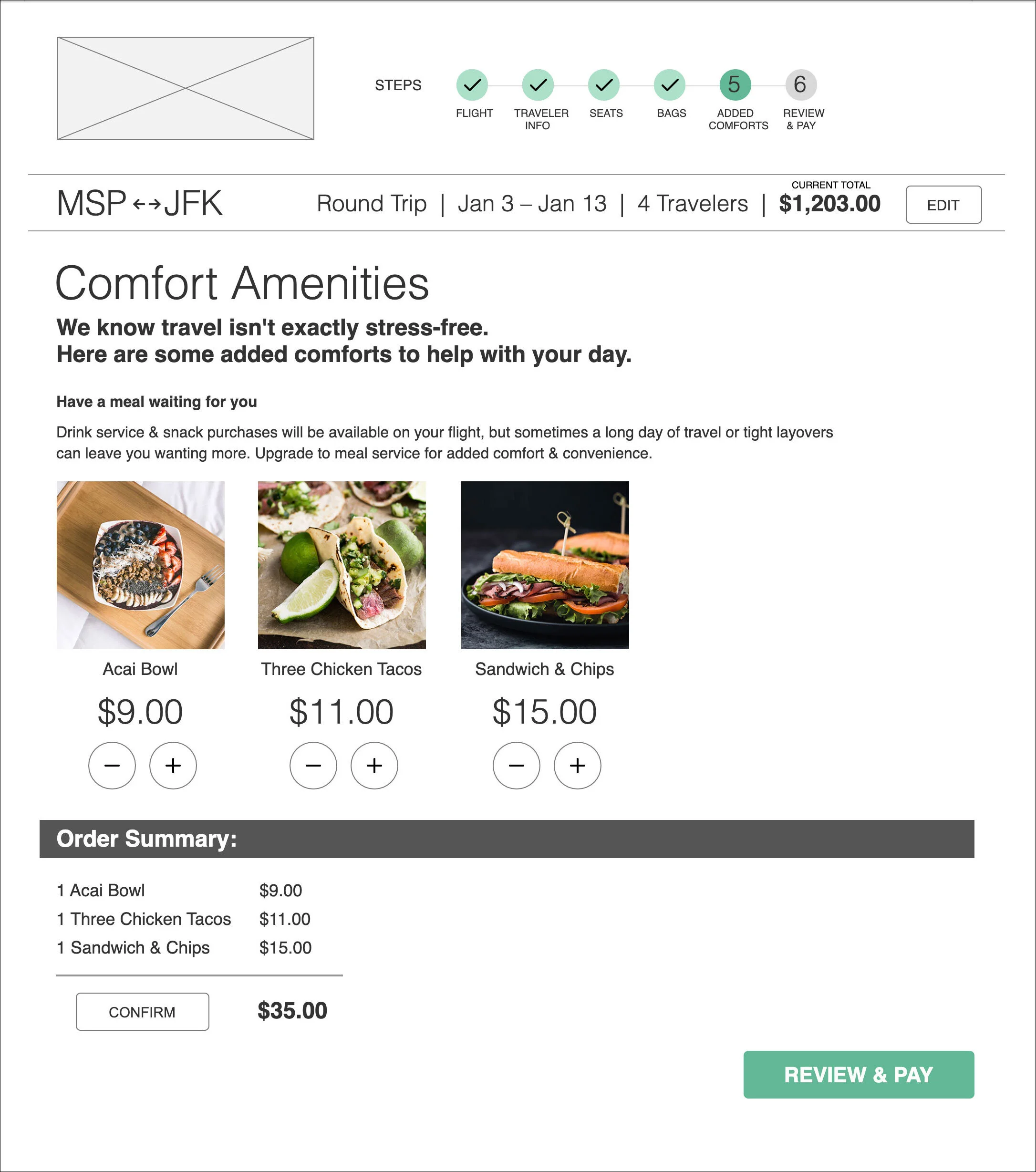
My user knows that sometimes when they’re just trying to make it through the terminal, grabbing food at a restaurant isn’t always an option.

User Test Findings:

“I like to know if things are going to be vegetarian.”
All users found the ability to add a meal to their reservation very intriguing. They liked seeing photos. They wanted to see more child-friendly options, and to have their dietary needs met. 


Travel Information


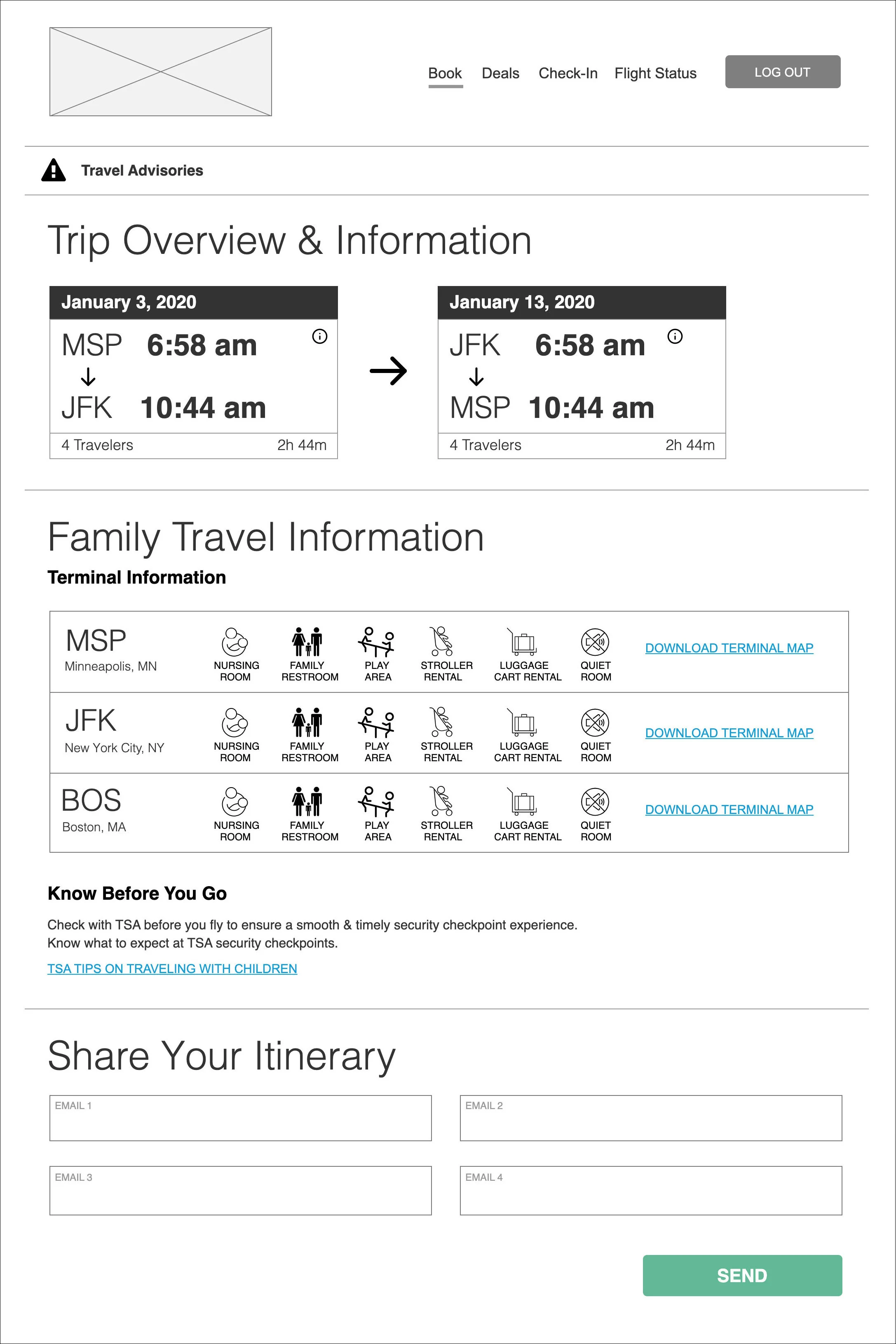
My user knows that navigating the terminal well can lead to a smoother flying experience for them + their children.

User Test Findings:

“I like how they have the terminal maps & amenities for the airports!”
All users were very surprised & delighted to see this type of information post booking. 

“I would want an airline to be this straight forward & clear.”
All users commented on how clear and easy the site was even with significantly more information to digest.


“I would want an airline to be this straight forward and clear.”

— Sarah M.


Other Case Studies: