Summary:
My client wants to engage volunteers in a trash clean up effort called Plogger by creating a tool that makes cleaning up while out on a daily jog fun and rewarding through gamification. This would help build up communities that may otherwise have limited resources to hold organized clean-up events.
Client:
Stone Arch Innovations
My Role(s):
UX Research + UX Design
Tools + Methodologies Used:
Cognitive Walkthrough
Contextual Inquiry
Prototyping
Sketch
InVision
Research
Data Synthesis
“Plogging is a combination of jogging with picking up litter.”
Approaching the Problem:
A Plogger tries to pick up the most trash they can in the shortest amount of time possible.
“Plogger,” a social health app, intends to create a community of Ploggers who improve their cities, towns, and neighborhoods.
To ensure that these intentions are clear, the Plogger app was analyzed through a cognitive walkthrough to see if a new user could perform specific tasks as well as understand the use case of the app. That data was then combined with contextual inquiries of both event planners and potential end users. They were asked to demonstrate how they would use the app and perform certain key tasks in addition to sharing their general thoughts.

Research Goals:
Better understand the current volunteer experience, context, and motivations (Tools, training, safety, coordination, incentivization, motivations, good day/bad day)
Understand current mechanisms for identifying, locating, and reporting outcomes of trash collection needs and efforts
Gain insight into scope, scale, and context of trash collection efforts and how this impacts organization/volunteers (Location, environmental/weather impacts, length of time, distance)
Gather insights on how Plogger’s proposed feature set might impact volunteer motivation/engagement
Cognitive Walkthrough:
I was given a list of tasks that were important to my client and walked through how, as a new user, I would perform those tasks against the initial wireframes.
The Questions Asked for Each Action:
Will the users be trying to achieve whatever effect action has?
Will users see the control (button, menu, label, etc) for the action?
Once users find the control, will they recognize that it will produce the effect that they want?
After the action is taken, will users understand the feedback they get, so they can confidently continue on to the next action?
Areas of Improvement:
On the initial wireframes, many areas of improvement were very small things like missing buttons, or feedback.
On the second set of wireframes, it might be helpful if a Plogger took a photo of the end result of the Plogging. A quantifiable visual representation that could be tied to the points or badge system.
My Findings:
There were many points where it was unclear as to why a person would take a photograph of trash instead of pick it up right then & there.
The metrics around the gamification of plogging don’t seem clear or easily quantifiable.
There isn’t currently a way to notify or say that you are going to pick up trash at a location. For example: “Claim a spot” or could it be a race to the spot? Perhaps this isn’t important.
There isn’t currently a way to invite others to join you or create a competition.
There seems to be two types of collection events: a quick Plogger-esque trash pick-up while running and an event that’s larger + more involved. Both need volunteers, one is self-initiated.
Contextual Inquiry
Contextual Inquiry Findings:
In order to connect the app with it’s users, we needed to gain insights on how an organizer or a volunteer would use the app. Frost Simula, from Heights Next, shared insights on how their organization hosts events and finds volunteers. Dan Rosenbush, a volunteer, shared insights on what motivates him as a volunteer and how he finds ways to volunteer.
A large theme that continued throughout all interviews was the social aspect of volunteering. Not only do groups of people get more done when they work together, they WANT to work together to get things done.
When I interviewed Dan Rosenbush about his volunteering experiences, he said he typically attends events that he has heard of through word-of-mouth, he likes to be/feel connected to his community and a goal. He also likes to accomplish whatever volunteer activity he’s setting out to do.
The lack of knowledge around how to recycle was mentioned in both interviews. People do not know how to recycle or what is recyclable, which poses challenges in what to do with the collected trash.
Putting it all together:
The strong theme of connection to others through volunteerism was where I started when prototyping my suggestions for how the Plogger app could move forward.
My Prototype Design Goals + Action Steps:
Create a way for a Plogger to invite small group of friends out for a friendly Plogging competition.
Create a route
Create an event with date, time, and meeting place
Notify friends that they’ve been invited to plogg.
Be able to invite anyone within the Plogger network
Allow invited participant to join or decline event
Message group about any last minute changes through app
The Prototype Process:
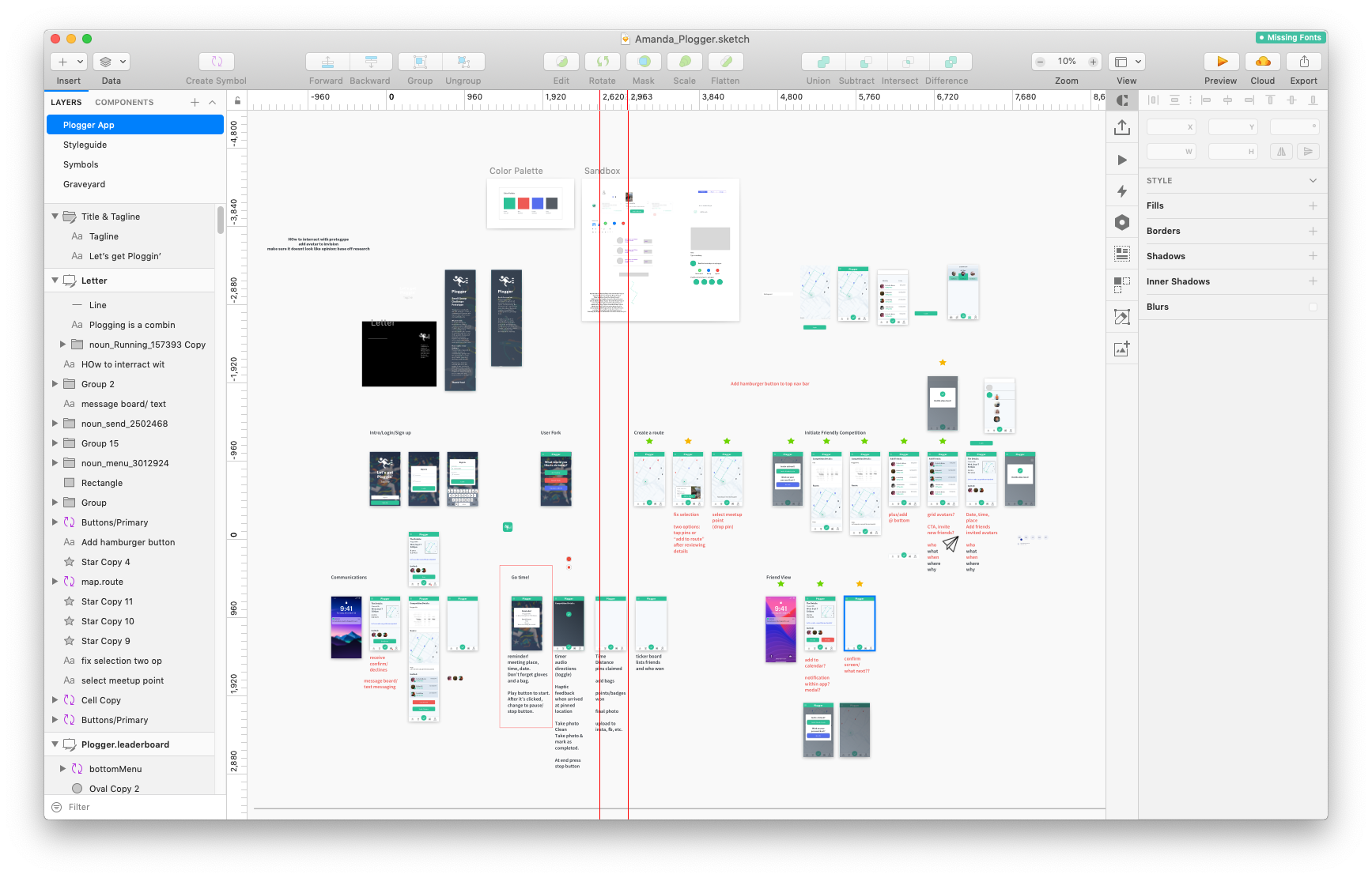
Sketching Out User Flows:
Creating High-Fidelity Wireframes in Sketch:
InVision Interactive Prototype:
Style Guide:
Next Steps:
With the UX design I’m suggesting, the goal is by building up a sense of community that efforts to keep the environment clean will instill pride in those who choose to Plogger and make a difference.
I’m thankful to have had the opportunity to work on this project. This Case Study is just a small piece of what was found and what can be done.


