Summary:
Street Cards is a nonprofit that serves the homeless community and those in need. They provide immediate relief by purchasing items for someone in need, while also learning about that individual’s story. This 18-month-old organization is looking for ways to strategically expand their impact.
My Approach:
Having worked in advertising and marketing, I immediately gravitated toward Street Cards' communications. Knowing how to make an impact in this space, I dug in.
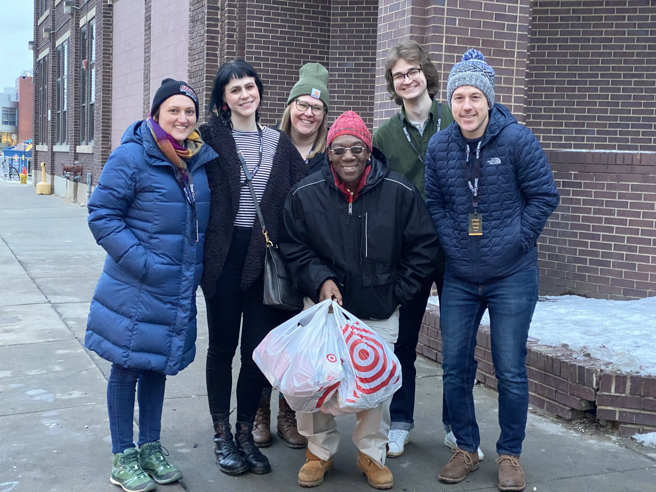
First, I volunteered for an event called a "Donation Day". Experiencing this event as a new volunteer helped me gain insights into what was going well and what areas could be improved.
Then I used this data to inform the changes I proposed to their website. Street Cards is awesome at making in-person connections to promote their organization. By pairing this method with clear content, the Street Cards brand will strengthen.
Client:
Street Cards
My Role(s):
UX Research + Content Strategy
Tools + Methodologies Used:
Journey Mapping
Communication Mapping
Content audit
Competitive analysis
Observations
Surveys
Interviews
Prototyping
What was the challenge?
Since many of Street Cards’ events involve directly engaging with people in need, there were potential stigmas and perceptions needed to be researched.
The Research:
Communication touchpoint map
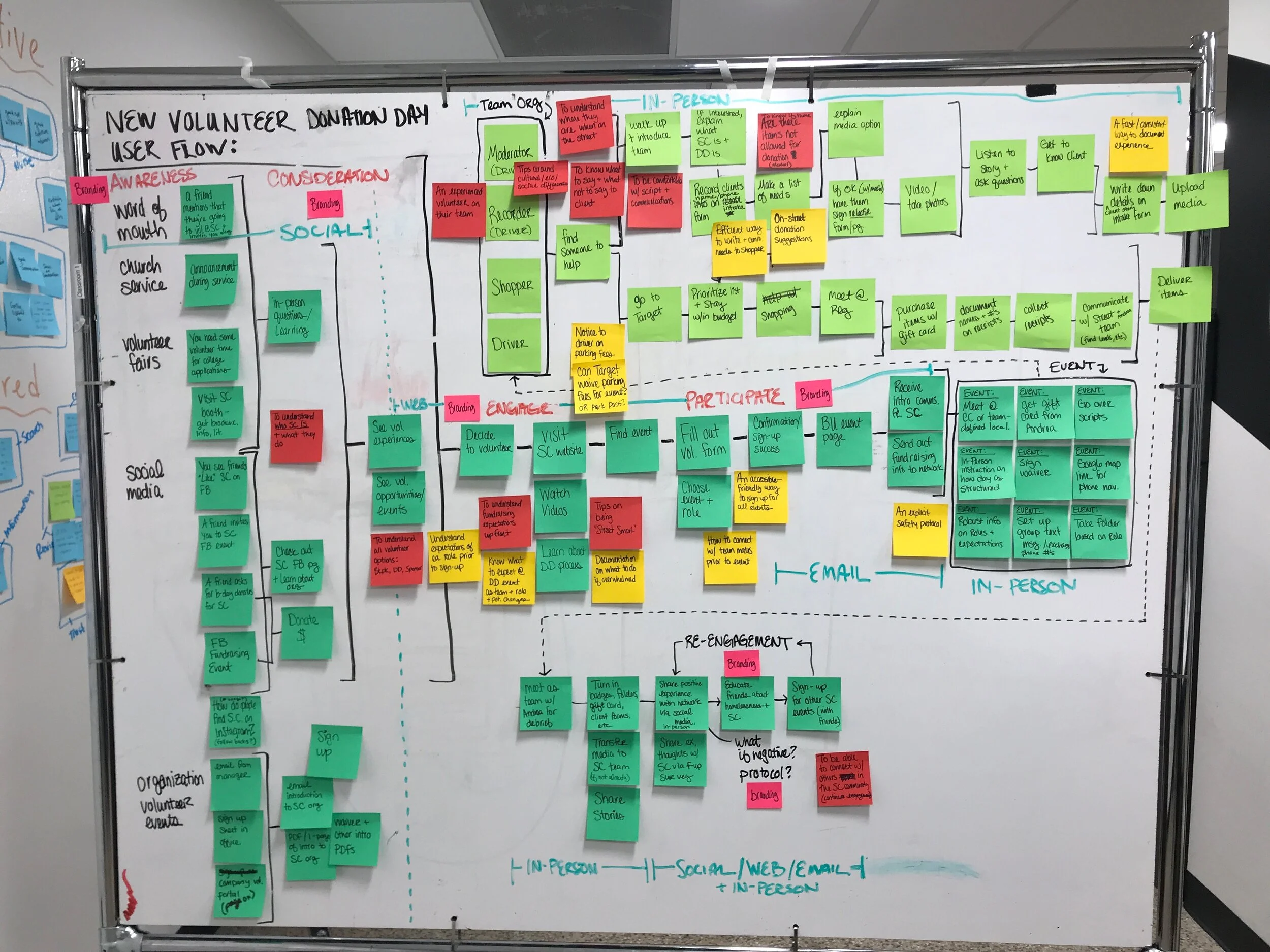
New Volunteer experience journey map
The most exciting finding:
Based on my survey results, I found out that volunteers are more than willing to help the homeless.
This is fantastic news for Street Cards! It means that the biggest hurdle is the growth of their network, which is totally do-able. To enforce these connections, Street Cards’ strong branding and clear communications will be sure to improve engagement.

The Prototype:
Navigation: A clear ‘Donate’ button has been added to the top right of the navigation. The intent is that the top navigation will be “sticky” so the ‘Donate’ button is always top of mind.
The Hero: I wanted to find a way to convey what Street Cards does quickly and succinctly. The phrase: “Empowering the public to step forward and help” was pulled directly from their mission statement. It’s an impactful way to say exactly what they’re trying to do and being able to put this front & center will strengthen their brand.
3 Ways to Volunteer: An icon set to represent the three ways a person can volunteer through Street Cards. Street Cards created a variety of volunteer options to make helping the homeless approachable.
Iconography: By implementing an icon set, a viewer quickly knows what kind of event they have to offer. I also thought being able to show the impact level (hearts) along with the time commitment of each would help a potential volunteer take action easier.
Ways to Volunteer: Volunteers like to do so in groups, so showing whether or not the event is a community event, team, or individual one-to-one is important.
Event Descriptions: Keeping the descriptions high-level is a way to be clear and concise while also creating interest.
Message: A new volunteer may be curious about Street Cards & who better, than the founder herself to speak to this in a video.
Next Steps:
With the online communications strategy is in place, I’m excited to put together a testing protocol to ensure that Street Cards is reaching their target audience and continuing to make a difference in our community.
With these new changes along with some targeted marketing, Street Cards will be able to engage a larger audience and reach their 2020 event and impact goals with ease.
I would like to thank Andrea Bert and Street Cards for the opportunity to work on this project. You’ve been a tremendous help and inspiration.


