Getting to Know the Business:
Who is ParkPoolr?
ParkPoolr is a shared service platform that aims to simplify the process of event parking by allowing individuals to pre-book a parking spot at alternate parking locations (e.g., homes with large driveways, businesses with empty lots) in areas adjacent to event venues.
The platform aims to increase access to parking options around special events and alleviate much of the confusion and congestion that occurs when event-goes are trying to find parking in the last minutes before the start of an event.
Their intent is to own the event-based parking market around Allianz Field in advance of the Minnesota United season kick-off next April (2020) by securing partnerships in that neighborhood and launching a native iOS app.
How Do We Help Them Along on Their Journey?
Partnering with Empathy.
Here’s my step-by-step method to gain empathy and clarity with my clients:
Learn as much as you can about the client.
Gain insights into what problems the client may be facing.
Learn about where the client wants to go and what goals they may have.
Ask questions to gain clarity.
Starting a project this way tends to yield the best results. Knowing what limitations or quirks you may be facing at the beginning of a project is also key for success.
By being empathetic to business needs as well as end-users, I’m able to provide thoughtfully tailored solutions that reduce pain points and improve clarity.
Goals:
ParkPoolr wants to:
Improve their retention rate
Lower the barrier-to-entry as much as possible (Easy sign up)
Ensure speed and learnability are low (easy to use)
Prioritize feature and flow modifications that would be ideal before the app launch
Now that we know how ParkPoolr wants to improve their web app, it’s time to being our research with a Usability Review to dig into what each of these goals means for the company from a UX practitioner lens. This will inform us on which heuristics to evaluate against.

The Plan:
Goals, Tasks + Methods
After gaining a better understanding of the web app, we then put together a plan on how to evaluate the web app with users.
Creating Empathy for the Users:
The Scenarios
We identified two main user groups: Drivers + Hosts. The two scenarios were used to provide context to the tasks we were asking them to perform.
DRIVER SCENARIO:
Now I’m going to have you imagine yourself in a specific scenario. Game day is coming up at Allianz Field & you’re excited to see the match. The last time you drove your car to a game you had a hard time finding a parking spot. Recently a friend told you about Parkpoolr that helps event goers find parking. You’ve decided to give it a try.
HOST SCENARIO:
For this scenario, imagine that your house is near Allianz Field. On game days, you’ve noticed that the street parking near your home is full during events. You just heard about ParkPoolr and you’re interested in generating some extra cash by listing the space in your driveway as a place for people to park during events.
Remote User Testing
We wanted to see how users did completing the tasks on their own computers. Video + audio of these sessions were recorded for future reference.

In-Lab User Testing:
Four participants were guided through the script and two scenarios in a controlled setting to gain insights on how well they completed the assigned tasks. Confidence was observed and noted at various pain points. Video + audio of these sessions were captured for reference.
“This would be nice!”
Gathering + Synthesize Data
After gathering data on over 12 user tests, we worked together as a team to externalize our findings into a Trello board so we could put similar observations together to see what themes stood out.
Observations were classified by confidence levels and task completion ability.

When it All Comes Together:
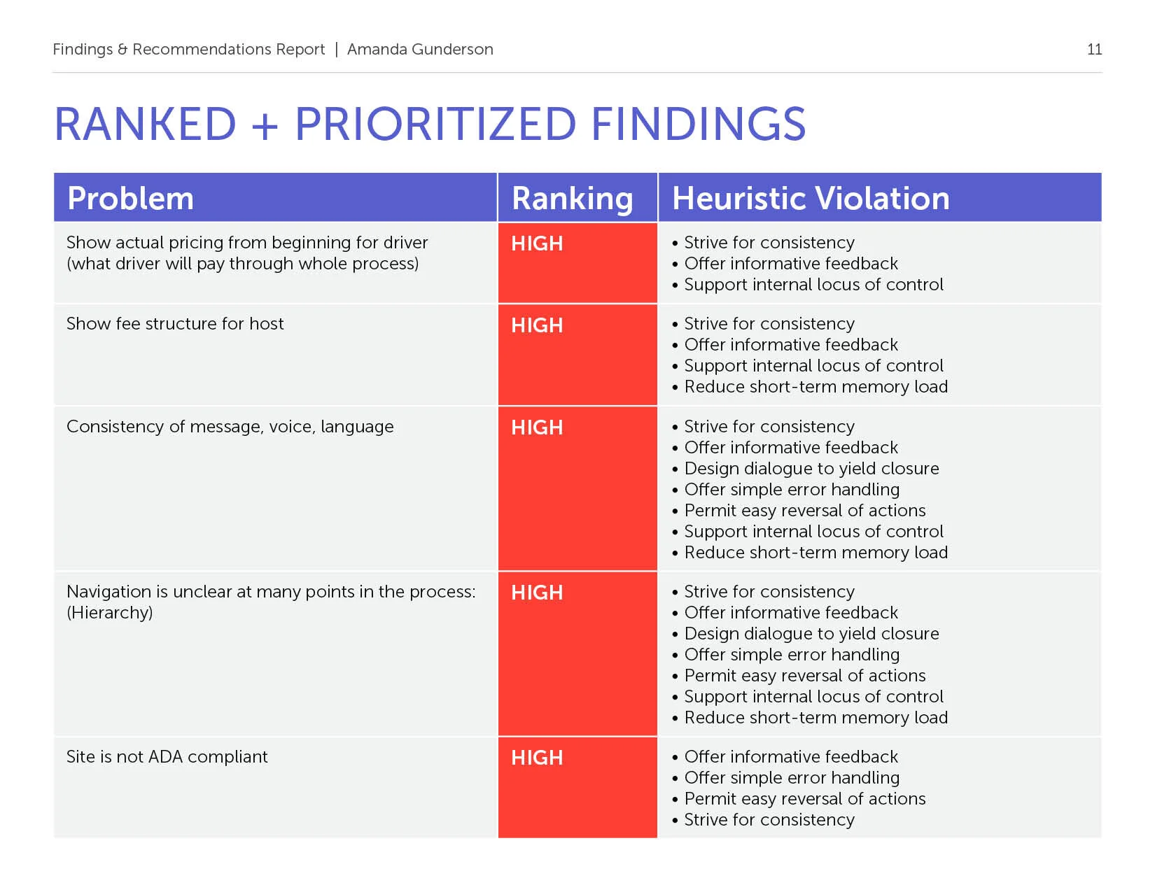
Findings + Recommendations Report
After synthesizing all of the data points, I created this Findings + Recommendations Report to show our clients at ParkPoolr what all that we found, what we are recommending in response to our research findings and why.
Next Steps:
Perform user testing with people in Allianz field neighborhood.
After finding recommendations are implemented, use Google Analytics to measure any differences in usage, drop off rates, and engagement.
Simplifying the top navigation creates a clearer call to action for the users.
Conclusion:
These findings will enable ParkPoolr to make some impactful changes to their website and service presentation and will help them connect with both existing and new customers.


