Summary:
The State of Minnesota is going through a digital transformation to consolidate its IT practices. The MNIT (Minnesota IT) Services team is a product of this transformation - they serve the technology needs of the state’s departments and agencies all the way down to all residents of Minnesota. An enterprise service ticketing software called Service Hub is used to streamline the IT requests that keep the state of Minnesota running.
The Group’s Approach:
In order to help MNIT improve the usability of their Service Hub, we researched the problem space, learned what’s working & what needs improvement.
Solutions we recommend:
Incorporate clear, plain language
Increase learnability and way-finding through improved navigation
Improve accessibility through WCAG standards.
Increased service visibility
Modify modal interface
What I Did Within This Space:
Being an enterprise-level software, there are many spaces to explore. I wanted to work on this project because of this very reason.
I was able to research the user experience through observations, moderating a couple of task-based cognitive walkthroughs, test prototypes to find out if they add value for the user or not.
I learned about the accessibility efforts the state is working to achieve and how those might shape the design recommendations.
Taking all of these things into account, I redesigned the way a user sees and interacts with a service form. By cleaning up the language, adding way-finding and breaking down the information, I hope to provide a much better form experience for the end users.
Client:
MNIT (Minnesota IT) Services
My Role(s):
UX Research + Content Strategy + Prototyping
Tools + Methodologies Used:
Content audit
Usability Review
Observations
Survey
Cognitive Walkthroughs
Evaluative Prototyping
Sketch
Human-Centered Design
What was the challenge?
Making changes within an enterprise level software platform can be tricky. There are technology restrictions that need to be taken into consideration while balancing that out with the needs of the user and the business.
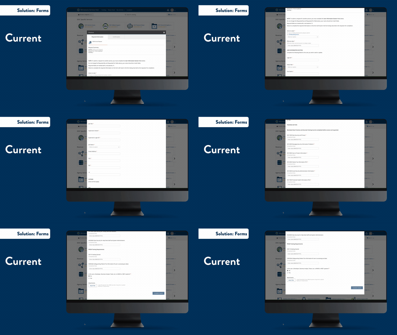
The Original Form:
Not all of MNIT’s forms are this long, but a common element is that most of them have hidden accordion menus. This means that new form fields appear when something is checked or filled in. There is currently no or very little visual difference to indicate these are new fields needing to be filled out, which can lead to form errors.
This isn’t even the form at it’s largest!
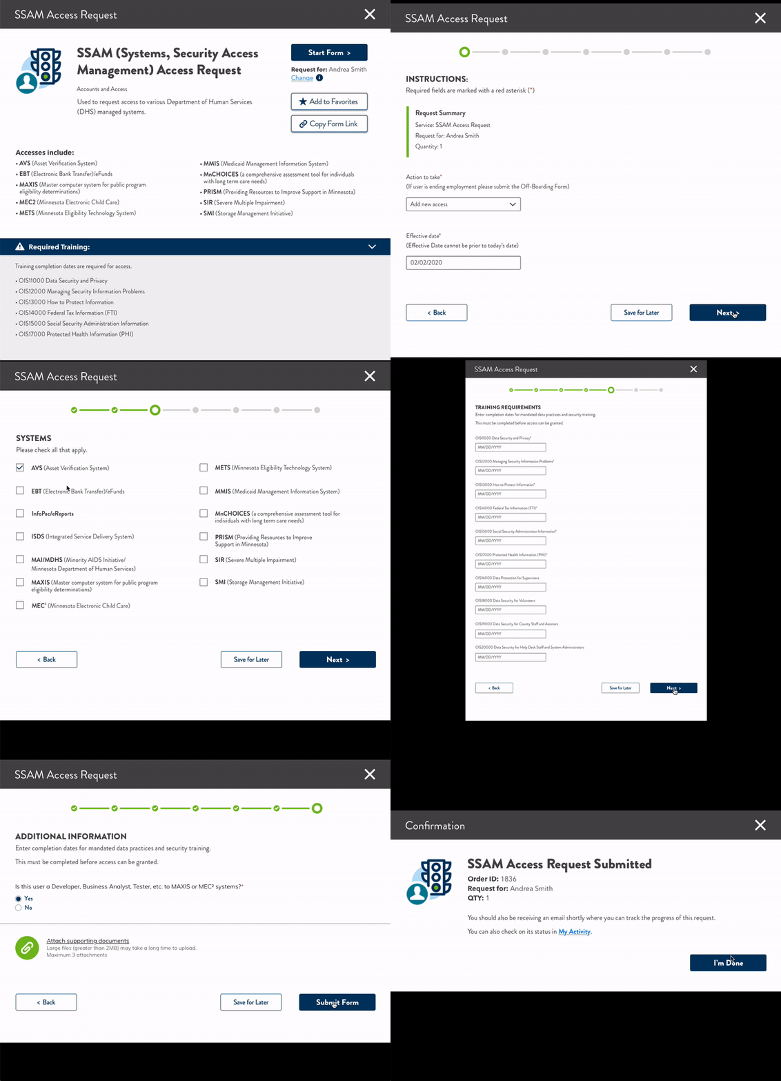
My Proposed Form Experience:
Language:
The first thing I did was find ways to create simple, clear and consistent language within the form.
Defining Acronyms:
By leaving the acronyms as-is, but adding supporting language after helps those who are newer or less familiar in the system a way to understand the language being used in the form.
Breaking It Down:
By chunking information, I was able to create sections that are easier to navigate during the form process.
Utilizing Database Content:
A large portion of the original long form is the manual entry of personal information and even training requirements. I’m not sure if MNIT can get their databases to talk to the Service Hub, but if they can, this could potentially eliminate data entry saving both time and money.
Accessibility:
An increase in contrast was added to fonts through color and font weight.
“Human-centered design around the Minnesota Service Hub is the primary goal I have [and] what interests me about this engagement.”
Next Steps:
My team and I provided a phased approach to align with our Findings & Recommendations report to make implementation easy for MNIT. Some of the smaller changes we recommend will have a great impact to MNIT’s end user.
We’re excited to see how MNIT will continue to implement and test changes with their end users. By setting MNIT up for success, we’re setting thousands of state employees up for success. These small changes will save the state and the end users both time and money, which is a win-win.


